In interior design, countertop choices play a significant role in defining a space’s aesthetic and overall ambiance.
As countertop trends continually evolve, a notable shift towards warm tones is showing up more and more.
While cool tones have long dominated the market, the resurgence of warmer hues has brought a new sense of depth, character, and coziness to modern kitchens and bathrooms.
Read on to explore how the countertop trends are moving towards warmer colors. We discuss the reasons behind this shift and its impact on the overall design landscape.
The Allure of Warm Color Schemes
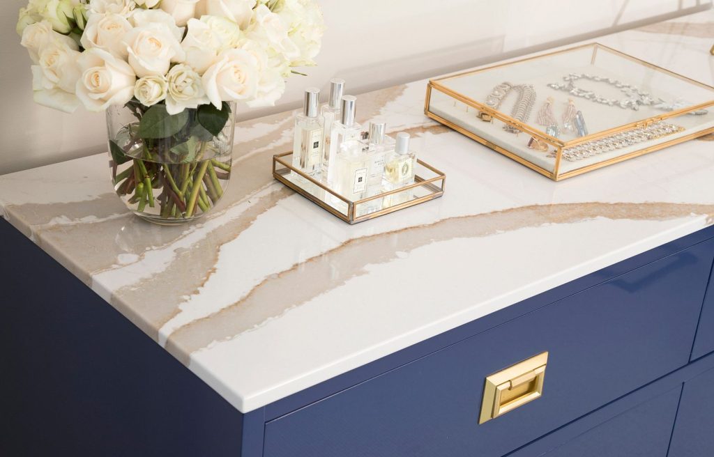
The appeal of warmer colors lies in their ability to evoke a sense of comfort and timeless elegance. Unlike cool tones, which can sometimes feel sterile or impersonal, warmer shades, like this Cambria Brittanicca Gold Warm create a cozy atmosphere that resonates with homeowners and designers alike.
The desire for a more inviting and nurturing environment has driven the increasing preference for countertops that exude warmth.
The Influx of Metallic Accents In Quartz Countertops
We are also seeing an increase in metal flecks or veining from all of our quartz suppliers. As things warm up, copper, bronze, and gold are showing up in our slabs. This adds a touch of opulence as well as reference to our natural world.
Exploring Earthy Countertop Tones
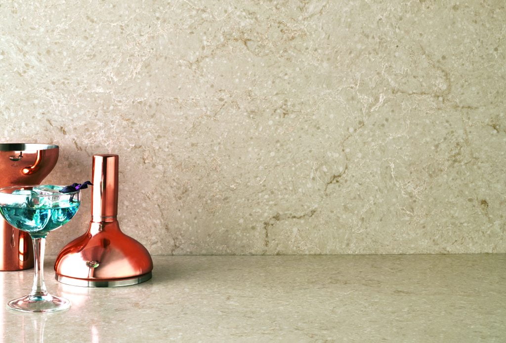
One of the key reasons warm countertop colors are trending is the rise in popularity of earthy tones. Colors inspired by nature, such as sandy beige, rich browns, deep reds, and burnt oranges, have gained popularity due to their ability to bring warmth and nature to any space.
We see these colors in some countertops but more often in accent pieces or paint colors. Caesarstone Taj Royale is a beautiful example of these earthy tones.
A Shift in Countertop Color Palettes
The move towards warm countertop colors has also prompted a shift in overall color palettes.
For example, designers and homeowners increasingly combine warm-toned countertops with natural wood cabinetry. This is a significant deviation from the many years we have seen painted cabinets filling up design magazine pages.
We also notice complementary hues like soft neutrals, warm grays, and muted pastels create a balanced and soothing backdrop to the warmer tops.
The Rise of Mixed Countertop Materials
Another notable trend along the same vein as countertops warming up is the incorporation of mixed materials.
Warm-toned countertops are often paired with contrasting materials like reclaimed wood, aged metals, or concrete. This combination creates a visually striking juxtaposition. The blending of textures and colors also adds depth, character, and a touch of nature to the space.
Influences from Other Countertop Design Styles
The shift towards warm countertop colors can also be attributed to the influences of trending design styles.
For instance, the resurgence of mid-century modern and bohemian aesthetics has brought warm tones to the forefront. These styles embrace natural materials, earthy palettes, and vintage-inspired accents. They make warmer countertops a perfect complement to their overall design scheme.
It’s hard to believe the cooler tones we’ve seen for so long in the countertop world would ever take a backseat to a warmer color palette. However, we have seen evidence of it in our showroom as well as in the kitchen and bath design world.
Marilyn Wright, our fabulous designer in our showroom adds, “Things are warming up. We are seeing a lot more copper and gold in quartz colors. Also, the cold grays and bright whites are definitely softening into creamier and warmer tones.”
An important note: If you already have countertops that are on the cooler side—fear not! Adding earth tone accents, a warmer tile backsplash, natural wood, and warm metals will up the cozy factor instantly.
Ready to Update Your Space?
As homeowners and designers seek to create spaces that are not only visually appealing but also comforting and inviting, we will continue to see warmer countertop colors increase in popularity.
Swing by our countertops showroom to see our show-stopping jumbo island featuring Pental’s Sable. This color shows off exactly what we have discussed – warm and sparkling copper veining on display!