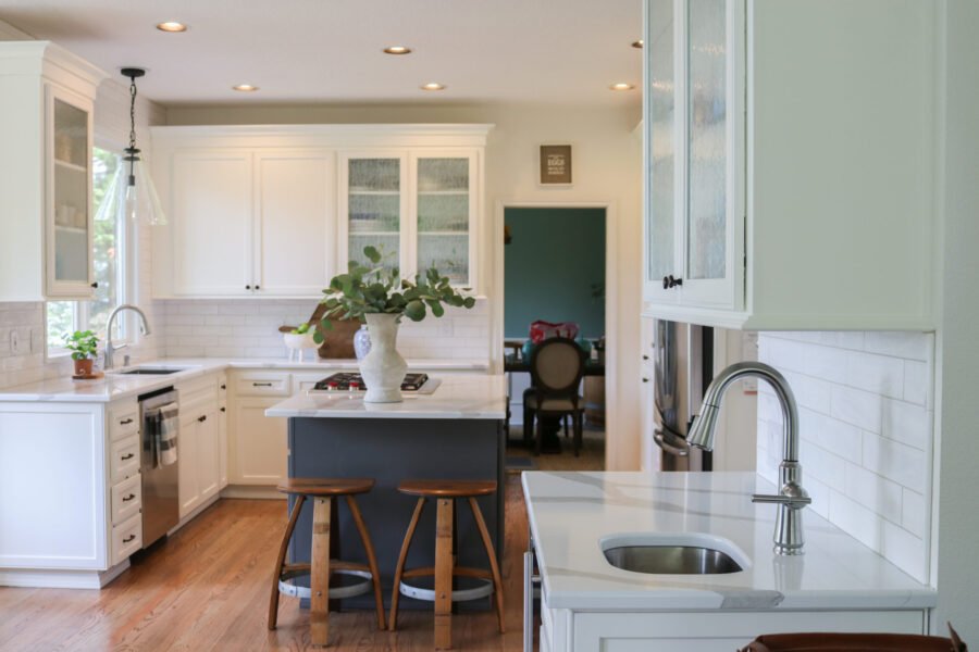
When we visited this newly renovated kitchen, Allie of Allie Jensen Design, shared that her client’s goal was to lighten and brighten the space as well as modernize it.
The before kitchen had a Tuscan feel with travertine backsplash and black granite. It was begging for an updated look, and this designer/client team worked together to create an absolutely stunning space. What makes it even better are the details that take form and function into consideration. Read on to see how this kitchen was transformed and the details that truly make it shine.
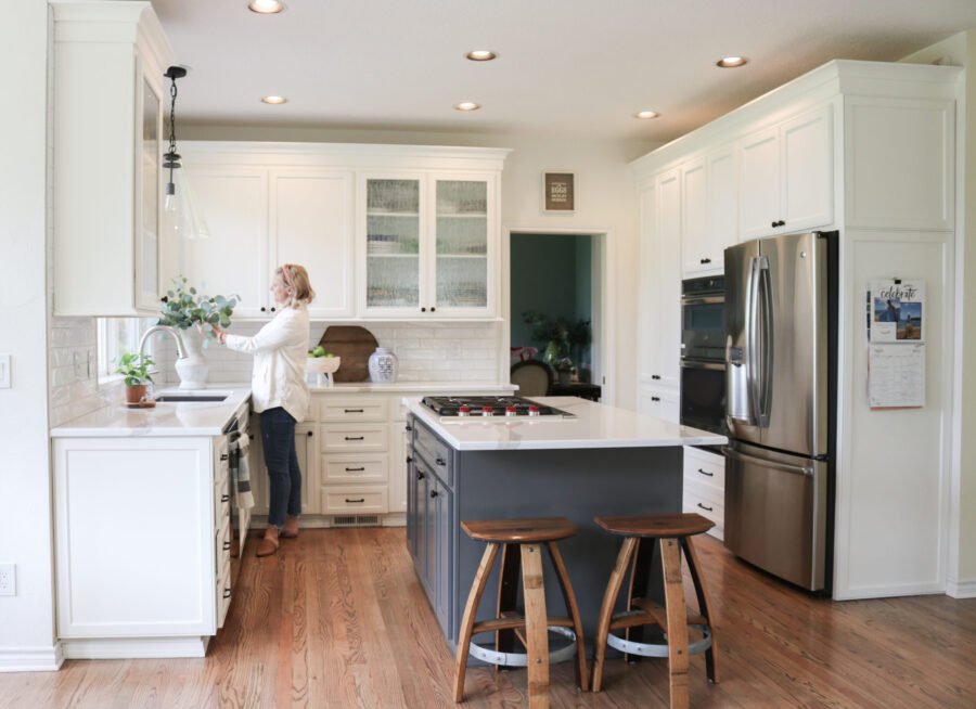
Five things we love about this kitchen renovation:
Materials
Before we dive into materials, we have to tell you the true showstopper here has nothing to do with Precision Countertops. When you first enter the kitchen, your jaw drops when you see the view from all of the windows. The kitchen is nestled among tree tops and you feel like you are perched amongst the birds. As we’ve written about before, the natural world is trending in all aspects of design. The colors used in this kitchen allows the eye to appreciate the whole environment. The space is calm, serene and uses natural tones so the view inside and outside don’t compete for your attention.
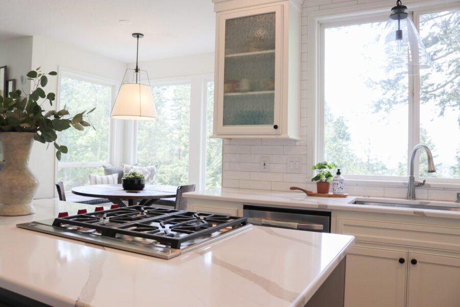
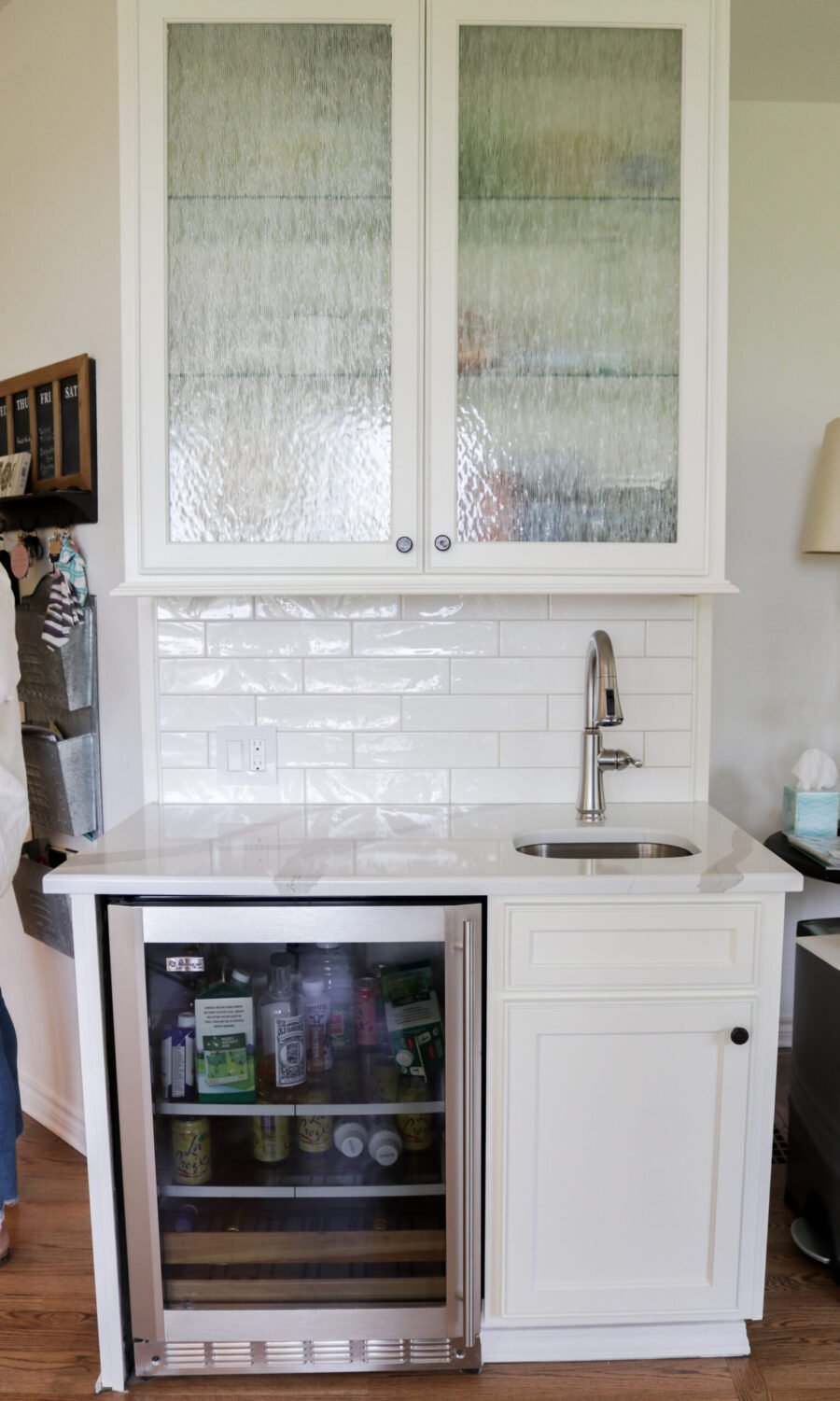
The white quartz countertops (Pental Arabescato) are manmade but still very much tell a story of organic opulence. There are so many different white quartz products, but this particular countertop caught my eye…and I wasn’t alone.
Allie Jensen shares, “My client makes up her mind quickly. She walked into the Precision Countertops slab gallery and saw this material and instantly knew it was the one.” This color has larger veins comprised of a warm gray with very small darker lines running along the edge. It’s clean and bright, but it feels very organic and warm. The rounded edge works well with the softer lines of the cabinetry.
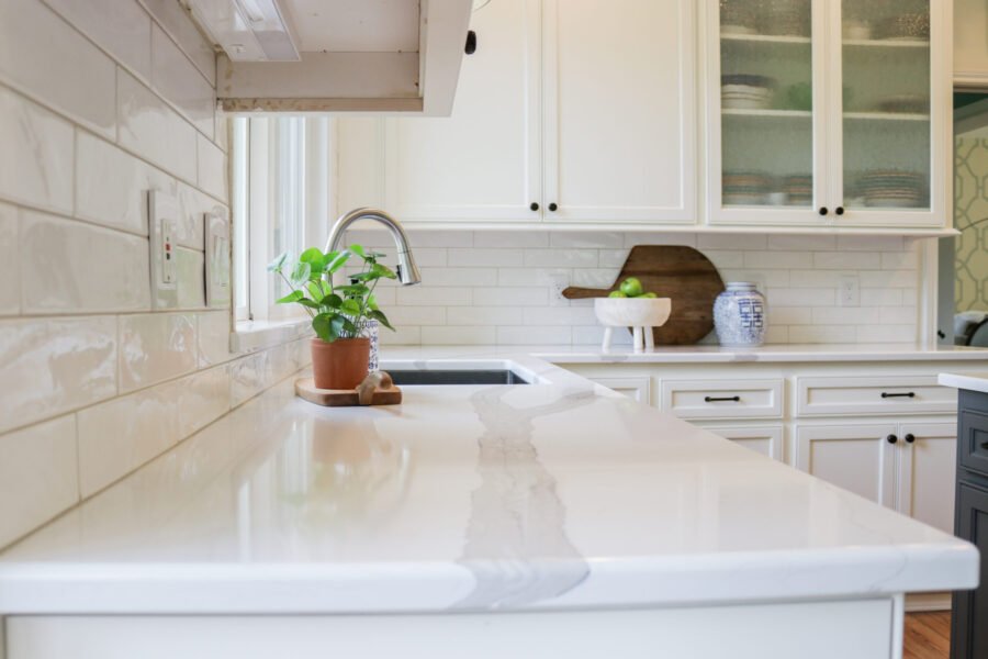
The cabinetry along the walls were painted in Pure White (SW7005) by Sherwin Williams and the island was painted in Benjamin Moore’s Kendall Charcoal (HC-166). This gray color is rich and luxurious and also offers the perfect palate to showcase the tops.
Structural Updates
Although this kitchen used the existing cabinetry, there were some updates that helped modernized the look. Allie decided to remove the ornate crown molding and push the top of the upper cabinets all the way to the ceiling. This removes the dead space between the tops of the cabinets and the ceiling which is impractical and dated. She then finished off the transition with a simpler molding.
Another structural change that had big impact on the project was the addition of a banquet in the nook area. Over the last year we have seen our kitchens become a hub for holding meetings, doing school, playing games and lingering longer over meals with our loved ones. Nothing answers this demand better than adding a banquet as it invites you to not only sit down, but to stay awhile.
A banquet also grounds the space, making it feel like a whole new area in the kitchen, rather than a free floating nook. Also, thanks to Allie’s great attention to detail, this banquet also doubles as storage. A simple drawer pulls out, offering easy access to extra cooking equipment.
Undermount Sink
You know how we feel about the undermount sink….so it gets a heading all of its own! No modern day kitchen should be without one. Any other option would have dated this kitchen back to its origins. The undermount sink is much easier to keep clean, looks modern and saves you from the nasty visual of gunk that collects around the rim of the top mount sink.
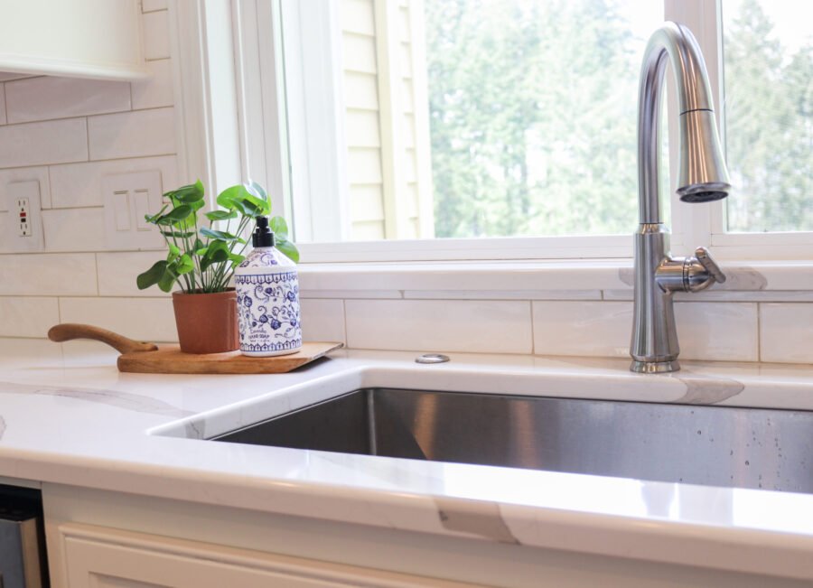
Of course, a beautiful detail was added to the sink area that bares mentioning. The window sill was built out with the same beautiful Pental Arabescato quartz…a durable and waterproof material with a punch of glam!
Tile
Tile moving beyond it’s historical six inches up the wall is definitely on the rise around here at Precision Countertops. We are seeing more and more tile being used up to the ceiling to create a tile wall. The tile used in this kitchen is an updated subway tile look, using white tiles that are 4 X 12 inches long. This tile is the perfect backdrop to the view outside the kitchen window. Tile that had any sort of pattern or color would have taken away from the beautiful quartz as well as the magnificent view. This tile marked off two goals…it brightened up the space and certainly modernized it as well.
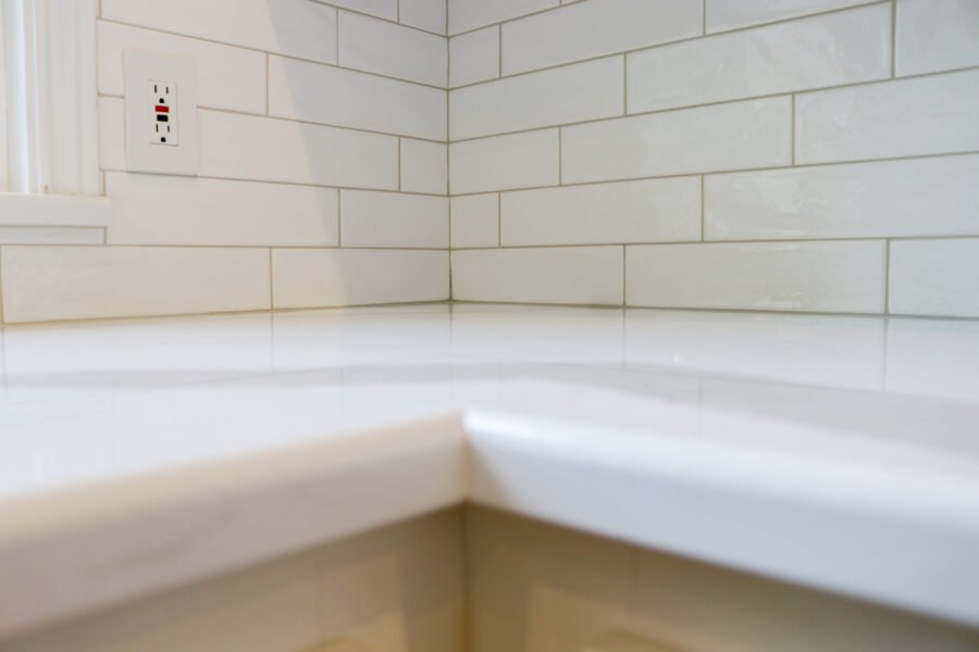
(Allie did mention how great it was to work with our tile team. It is hard to manage or even find!) a tile installer that is willing to do smaller jobs like a backsplash or tile wall. We take so much pride in our turnkey tile installation process which makes it so easy for our customers.
Details
So many elements came together perfectly to create this gorgeous kitchen. As we know, a great kitchen renovation often has a mastermind behind the curtains and in this case it was the design brilliance of Allie Jensen Interiors. According to National Kitchen and Bath Association, 54% of new kitchen renovations were done with a designer on board. Hiring a designer doesn’t mean you don’t have input. It does mean an experienced professional can advise you on trends, pay attention to things you didn’t even know needed your attention and help you create a beautiful space that also functions well. When working with clients, Allie likes to gather all of the images you love and helps you build on them to create your own unique space. Her style is classic, but loves trends that can be easily changed out as time passes. Timeless elegance achieved!
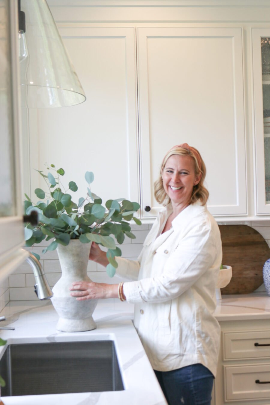
Allie’s superpowers aren’t limited to kitchen renovations. She is an interior designer as well and loves to make all spaces beautiful. She can be reached at 503.756.3378 or [email protected]. Follow her on Instagram at @alliepjensen