We know it seems like there are many decisions to make when designing your kitchen or bath space.
One important decision that seems small, is how to choose grout color for your tile. Andrew, one of our showroom designers, says, “Many clients can’t believe there is still another decision to be made.” Grout color is a critical component that can drastically change the look and feel of your space.

3 Tile and Grout Color Combinations
The good news… there are essentially only three different tile and grout color combinations to choose from.

Choice One — Matching Grout Color
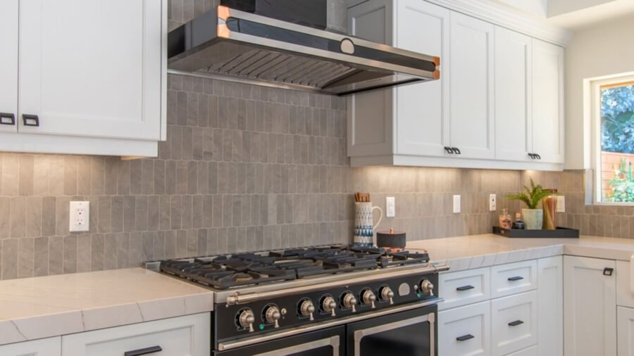
When you really want the tile to be the center of attention and not the pattern of your tile, a matching grout color should be implemented. When the colors blend it allows your eye to rest and not see the geometrical lines—it will instead get drawn to the texture and color as a whole. This style works well with neutral colors like white.
Andrew mentions, “Matching grout color highlights the texture of the tiled space and hides the individual shapes of the tiles.”
Matching grout color to the tile color can be used in all settings from the most traditional to modern contemporary. The look will change with the choice of your tiles and how they are used in the space.
Choice Two — Contrasting Grout Color
Choosing contrasting grout colors will up the graphic impact of your space and makes a statement. The darker grout will make the tile pattern and color pop. You can imagine your typical white subway tile with white grout and then think about the same tile with a dark charcoal gray. Instantly your eye will pick up the patterns in the tile.
Choosing contrasting grout is on trend right now and often found in more modern or industrial design. Remember, if you decide to use a dark grout, this will take up a lot of space in your overall design. It will be the equivalent of an accent wall and most likely the room won’t be able to take on another graphic focal point.

Choice Three — Complimentary Grout Color
Although this may seem like the boring choice, it’s actually the most common. Complimentary colored grout is a balance between the matching and contrasting schools of thought. Usually a neutral grout color is in the gray family and it serves to compliment the tile but not be as eye-catching or graphic as a contrasting grout color.
How Precision Countertops Can Help You
The great news is, our designers can help you navigate this important decision as well as many others that go into creating your dream kitchen or batch. Andrew mentioned that almost 90% of grout choices are our Bright White or Smoke Gray colors so looking at these two options is a great starting point to see if they will fit into our design scheme.
Also Read: Three Reasons Why It’s Essential To Choose a Countertop Company That Has an In-House Tile Program